
A new chapter for the AIM
- Jun 1
- 2 min read
The InterMonasteries Alliance is expanding
In 2025, the AIM updated its ecclesiastical statutes by broadening its partnerships and emphasising the reality of a structure shared by the three major orders that follow the Rule of Saint Benedict. In line with these changes, the AIM is embarking on a significant turning point in its development, adopting new civil statutes, a new name and a new visual identity to promote its identity, highlight its international dimension, and unify and simplify its communications.
One name, one language, one message
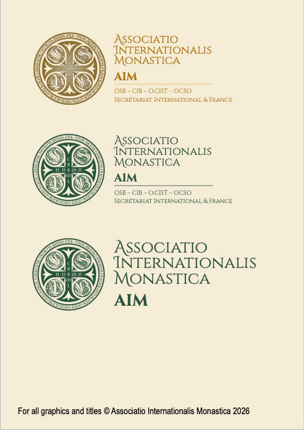
The acronym AIM has had several meanings over the course of its history. The most recent name, “Alliance Inter Monastères”, had become a hindrance to international communication and was no longer conducive to the association’s current development. Instead of having to translate—no easy task given the acronym—presentations and letterheads into every language, we now have a single name, a single logo, a single identity—for all languages and all countries.
The Latin name Associatio Internationalis Monastica addresses these challenges with clarity. As the universal language of the Church, Latin is immediately recognised throughout the Catholic world. It highlights the institutional dignity of the AIM in harmony with its role of coordination among the major monastic families. The acronym AIM remains unchanged as a strong and internationally recognisable symbol: a united monastic fraternity, at the service of the Church’s mission in the world.
A development rooted in heritage
After many years of using a logo that was beginning to show its age, the AIM decided to undertake a complete overhaul of its visual identity. The aim is clear: to modernise the association’s image whilst ensuring consistency across its communication materials in all languages, serving the three orders it brings together.
Far from being a break with the past, this change is part of a wider trend towards a return to classic styles seen in many cultural and institutional spheres. AIM responds to this with a visual identity that is at once reassuring, universal and conveys its spiritual message: combining ora and labora at a single glance.
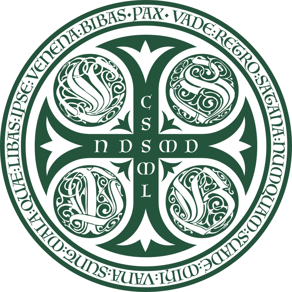
A logo steeped in history
At the heart of this new identity sits the Medal of Saint Benedict, reinterpreted as an institutional seal that is perfectly suited to an international coordinating organisation and immediately conveys the legitimacy and long-standing history of the AIM.
A colour palette that conveys messages

The new brand identity is built around three carefully chosen colours: Green, a liturgical colour, symbolising generosity, hope and life; gold, present throughout the iconography, which distinguishes AIM from the world of generalist NGOs; and parchment, evoking naturalness and simplicity, and conveying kindness. The Cinzel typeface, classic and legible, completes the ensemble.
A brand identity designed to raise the profile of AIM

This development addresses a strategic challenge: to raise awareness of AIM far beyond its usual circles, to engage the general public and partners, and to attract and retain international donors.
The new branding will be rolled out gradually across all of the association’s communications channels.


Comments